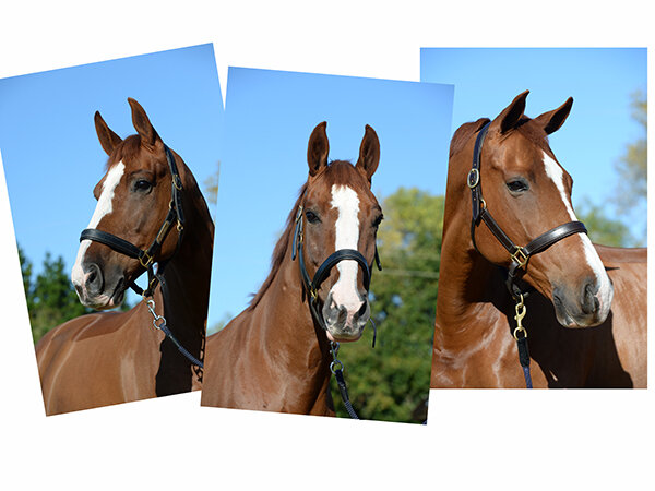
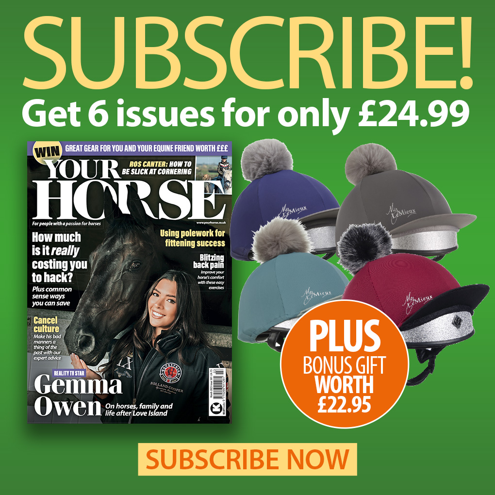
This week we’re giving you the opportunity to have your horse featured on the cover of our magazine. We want everyone to have the best chance possible, so we asked Your Horse photographer Matthew Roberts for his advice on how to take a great cover image.
The simplest type of shot Your Horse magazine use for a front cover picture is a headshot of a horse. It’s the sort of picture which is commonly taken by horse owners on a very regular basis.
With just a few tips it’s possible to achieve a really professional result which could grace the cover of a national magazine.
What camera do you use?
I would normally use a Nikon DSLR camera which has interchangeable lenses. This means I can choose the appropriate lens for the situation.
For pictures like this I would normally use a 70-200mm lens which is a telephoto zoom. I would aim to use it at close to the 200mm end as possible as it is most flattering for portraits.
I use autofocus and position the focus point on the horses head. Normally I shoot in manual mode but the auto modes on most cameras will produce really good results so go with what you’re used to.
If you have something similar to this it will be much easier to get professional results rather than using a mobile phone.
You might have a compact camera with a zoom lens which would be a really good alternative. Again I would choose to zoom to the higher number which will help to isolate your horse from the background.
What advice can you give for using mobile phone cameras?
Many people these days record daily events on the built in camera on a mobile phone. This has so many advantages, the main one being that for most people the phone is always with them so it’s easy to grab it and snap a shot.
Unfortunately the basic camera settings don’t necessarily achieve the best picture in this situation.
Until recently most phones came with a camera with one lens which was normally a medium wide angle.
This is great for a multitude of situations but not that good for a lovely portrait of your pride and joy.
The wide angle lens has the effect of emphasising the nose which is not that flattering. Fortunately more recent models have started to include multiple lenses and also portrait modes which give much more opportunity to get really pleasing results.
Portrait mode: Although this uses the same lens as normal the camera cleverly blurs the background which draws the attention to the subject.
It is a similar result to what I can achieve using camera settings so it’s really worth playing with. Although do bear in mind while photos can look great when viewed on the phone screen, when they are enlarged the blurring can sometimes be a bit random.
There are now quite a few phone models which use portrait mode so it’s worth checking to see if yours has it built in. It might take a bit of trial and error to get the best results.
Multiple lenses: The latest phones are now starting to use multiple lenses which is a real step forward for how your pictures can look.
I’m going to use the iPhone 11 Pro as an example. It comes with three lenses: very wide angle, medium wide angle and telephoto.
For this particular situation the telephoto lens would give the best result. It would be as close to the camera setup I would use to photograph for a front cover.
Again check to see if your phone has this facility.
Achieving a good quality image
As the picture will be used quite big on the front cover it’s important to make sure whatever equipment you use is set to produce the best quality possible.
On a DSLR or compact camera I would choose JPEG at a high quality setting. This would be on most cameras in the menu settings.
It’s a bit different with a mobile phone. Normally the quality is just a preset when you take the picture. It’s when you come to send it by email that there are options to reduce the quality and size. In this instance the highest quality would be needed.
How to take the picture
On a sunny day I would stand with the sun behind me at a distance from the horse so I can nicely fill the frame.
Check back issues of the magazine for examples of how pictures are used – there always has to be a bit of space around the head for words.
I would ask someone to handle the horse to make sure it is in the best position and then ideally would have someone else to try and get ears forward.
One of the important things is to consider is the background. I would always look for something which isn’t going to distract from the subject.
Good backgrounds are trees in full leaf, a big hedge, a lovely view or even the sky if you can get low enough.
A common mistake I see is to have the horse very close to the trees or hedge. What you end up with is the horse and hedge in focus. If you can move the horse away from the background it will naturally start to be out of focus and the attention is back on the your subject.
It’s important to check if your horse’s head is in focus and also that the exposure is good (not too dark or too bright).
It’s possible to adjust the exposure with all cameras including phones so check how this can be done with your particular camera.
Here are some examples of different angles I would commonly use on a cover shoot. Some horses will stand better in certain ways so it’s a good idea to have a play around with ideas.
Don’t miss the latest issue of Your Horse Magazine, jam-packed with training and veterinary advice, horse-care tips and the latest equestrian products, available now.

